Preview Plotly charts in Kedro-Viz
This page describes how to make interactive visualisations of a Kedro project with Kedro-Viz, which supports integration with Plotly.
We use the spaceflights tutorial and add a reporting pipeline. Even if you have not yet worked through the tutorial, you can still follow this example; you’ll need to use the Kedro starter for the spaceflights tutorial to generate a copy of the project with working code in place.
If you haven’t installed Kedro follow the documentation to get set up.
Important
We recommend that you use the same version of Kedro that was most recently used to test this tutorial (0.19.0). To check the version installed, type kedro -V in your terminal window.
In your terminal window, navigate to the folder you want to store the project. Generate the spaceflights tutorial project with all the code in place by using the Kedro starter for the spaceflights tutorial:
kedro new --starter=spaceflights-pandas
When prompted for a project name, you can enter anything, but we will assume Spaceflights throughout.
When your project is ready, navigate to the root directory of the project.
Update the dependencies
There are two types of Plotly datasets supported by Kedro:
plotly.PlotlyDatasetwhich only supports Plotly Expressplotly.JSONDatasetwhich supports Plotly Express and Plotly Graph Objects
To use the Plotly datasets, you must update the requirements.txt file in the src folder of the Kedro project to add the following dependencies:
kedro-datasets[pandas.CSVDataset, pandas.ExcelDataset, pandas.ParquetDataset]~=1.1
kedro-datasets[plotly.PlotlyDataset, plotly.JSONDataset]~=1.1
Navigate to the root directory of the project in your terminal and install the dependencies for the tutorial project:
pip install -r src/requirements.txt
Configure the Data Catalog
To use the datasets, add them to the Data Catalog by updating conf/base/catalog.yml:
shuttle_passenger_capacity_plot_exp:
  type: plotly.PlotlyDataset
  filepath: data/08_reporting/shuttle_passenger_capacity_plot_exp.json
  versioned: true
  plotly_args:
    type: bar
    fig:
      x: shuttle_type
      y: passenger_capacity
      orientation: h
    layout:
      xaxis_title: Shuttles
      yaxis_title: Average passenger capacity
      title: Shuttle Passenger capacity

shuttle_passenger_capacity_plot_go:
  type: plotly.JSONDataset
  filepath: data/08_reporting/shuttle_passenger_capacity_plot_go.json
  versioned: true
Create the template reporting pipeline
In the terminal, run the following command to generate a template for the reporting pipeline:
kedro pipeline create reporting
Add the Plotly reporting nodes
Add the following to src/spaceflights/pipelines/reporting/nodes.py:
import plotly.express as px
import plotly.graph_objs as go
import pandas as pd

# This function uses plotly.express
def compare_passenger_capacity_exp(preprocessed_shuttles: pd.DataFrame):
    return (
        preprocessed_shuttles.groupby(["shuttle_type"])
        .mean(numeric_only=True)
        .reset_index()
    )


# This function uses plotly.graph_objects
def compare_passenger_capacity_go(preprocessed_shuttles: pd.DataFrame):

    data_frame = (
        preprocessed_shuttles.groupby(["shuttle_type"])
        .mean(numeric_only=True)
        .reset_index()
    )
    fig = go.Figure(
        [
            go.Bar(
                x=data_frame["shuttle_type"],
                y=data_frame["passenger_capacity"],
            )
        ]
    )

    return fig
Update the reporting pipeline code
Update src/spaceflights/pipelines/reporting/pipeline.py to replace the existing code with the following:
from kedro.pipeline import Pipeline, node, pipeline
from .nodes import compare_passenger_capacity_exp, compare_passenger_capacity_go


def create_pipeline(**kwargs) -> Pipeline:
    """This is a simple pipeline which generates a pair of plots"""
    return pipeline(
        [
            node(
                func=compare_passenger_capacity_exp,
                inputs="preprocessed_shuttles",
                outputs="shuttle_passenger_capacity_plot_exp",
            ),
            node(
                func=compare_passenger_capacity_go,
                inputs="preprocessed_shuttles",
                outputs="shuttle_passenger_capacity_plot_go",
            ),
        ]
    )
Run the pipeline
Now run the pipelines:
kedro run
Then visualise with kedro viz run
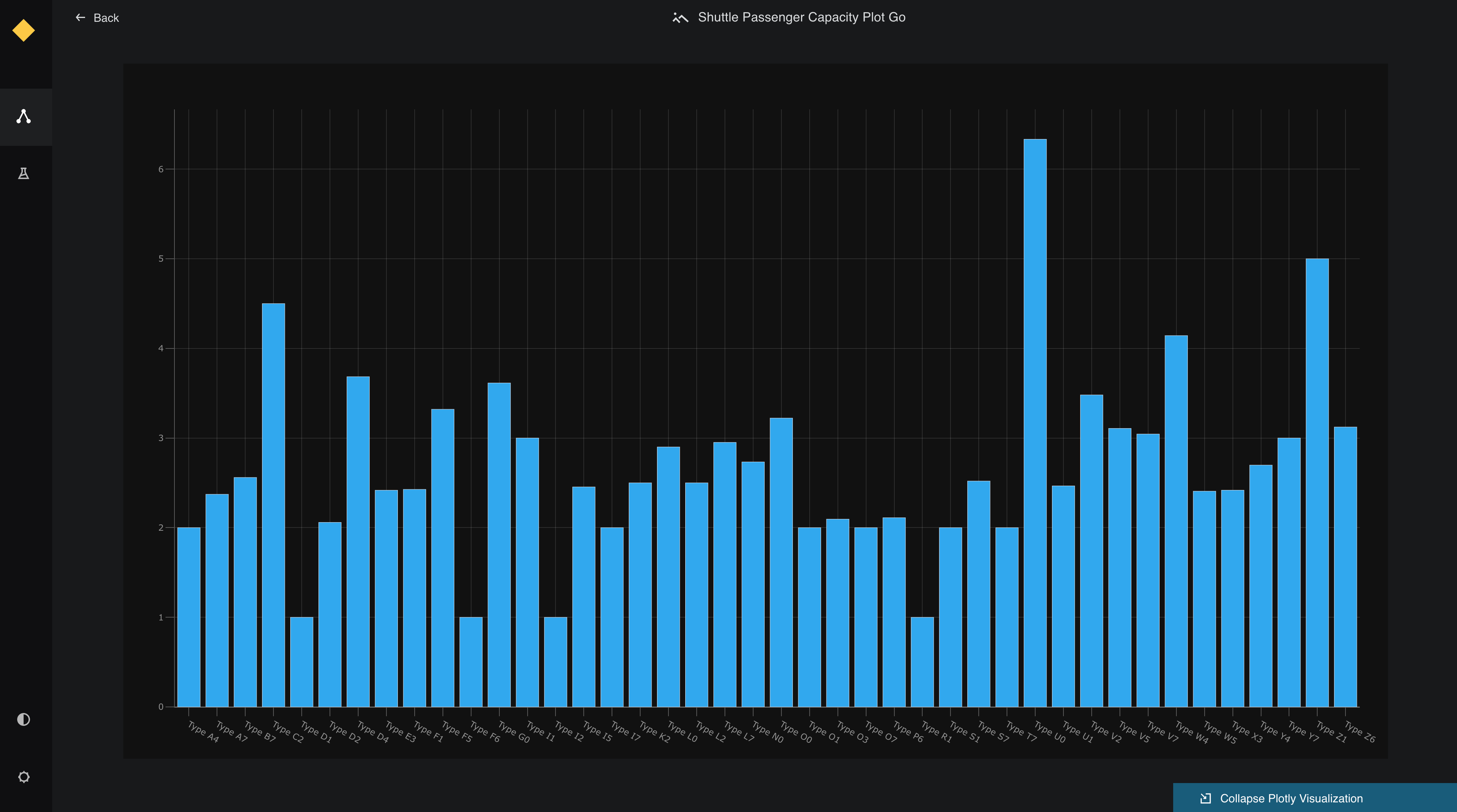
The generated charts are shown as follows:
![]() .
.
Click on each of see a small preview in the metadata panel:
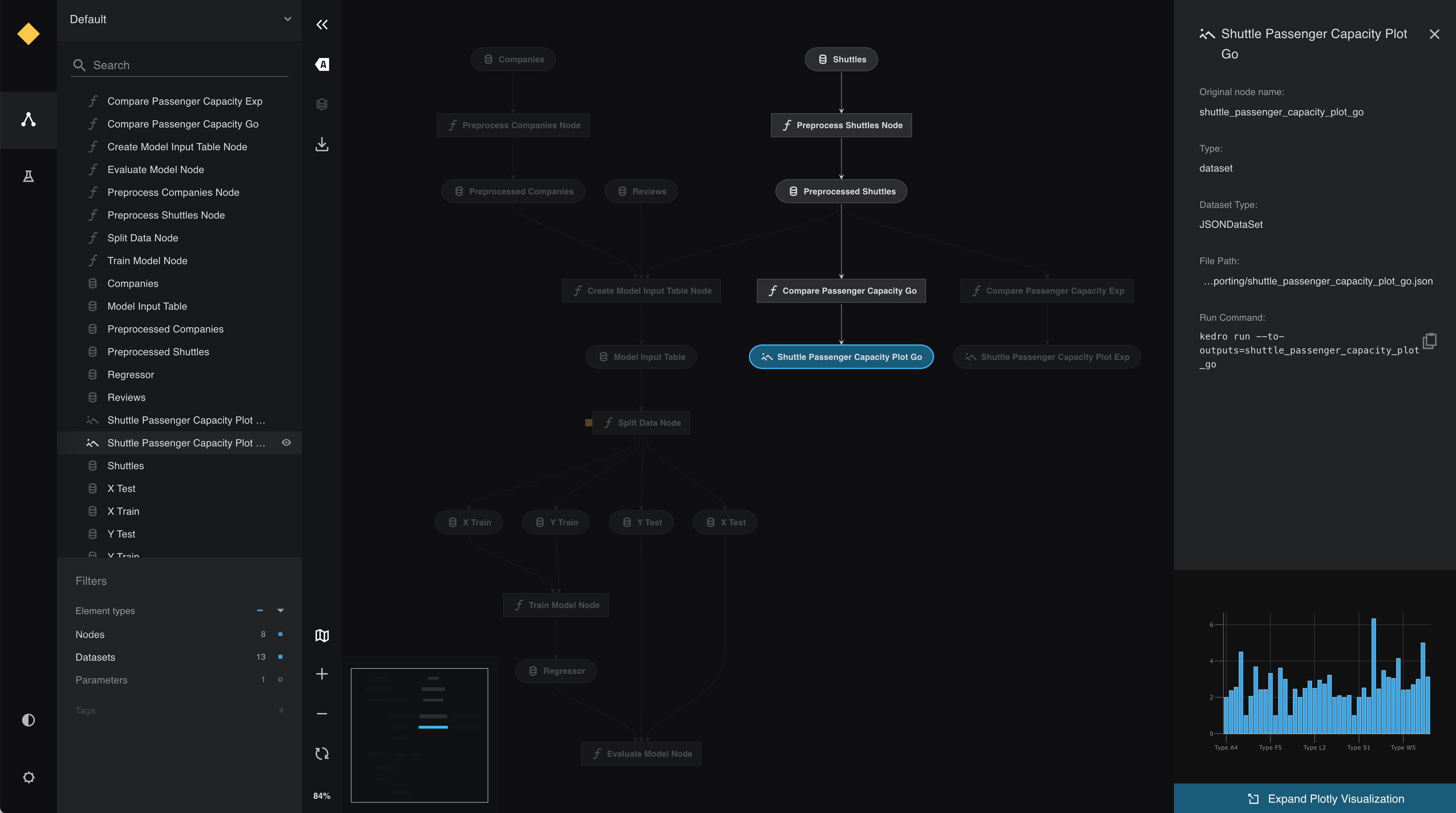
View the larger visualisation of the chart by clicking the ‘Expand Plotly Visualisation’ button on the bottom of the metadata panel.