Preview Matplotlib charts in Kedro-Viz
This page describes how to output static visualisations of a Kedro project with Kedro-Viz, which supports integration with Matplotlib. You can view Matplotlib charts in Kedro-Viz when you use the MatplotlibWriter dataset.
Note
The MatplotlibWriter dataset converts Matplotlib objects to image files. This means that Matplotlib charts within Kedro-Viz are static and not interactive, unlike the Plotly charts seen separately.
We use the spaceflights tutorial and add a reporting pipeline. Even if you have not yet worked through the tutorial, you can still follow this example; you’ll need to use the Kedro starter for the spaceflights tutorial to generate a copy of the project with working code in place.
If you haven’t installed Kedro follow the documentation to get set up.
Important
We recommend that you use the same version of Kedro that was most recently used to test this tutorial (0.19.0). To check the version installed, type kedro -V in your terminal window.
In your terminal window, navigate to the folder you want to store the project. Generate the spaceflights tutorial project with all the code in place by using the Kedro starter for the spaceflights tutorial:
kedro new --starter=spaceflights-pandas
When prompted for a project name, you can enter anything, but we will assume Spaceflights throughout.
When your project is ready, navigate to the root directory of the project.
Update the dependencies
You must update the src/requirements.txt file in the Kedro project by adding the following dataset to enable Matplotlib for the project:
kedro-datasets[matplotlib.MatplotlibWriter]~=1.1
seaborn~=0.12.1
Configure the Data Catalog
You must also specify the output type in the catalog.yml file for the Data Catalog:
dummy_confusion_matrix:
  type: matplotlib.MatplotlibWriter
  filepath: data/08_reporting/dummy_confusion_matrix.png
  versioned: true
Add another node
Add the following to src/spaceflights/pipelines/reporting/nodes.py:
import matplotlib.pyplot as plt
import seaborn as sn
...
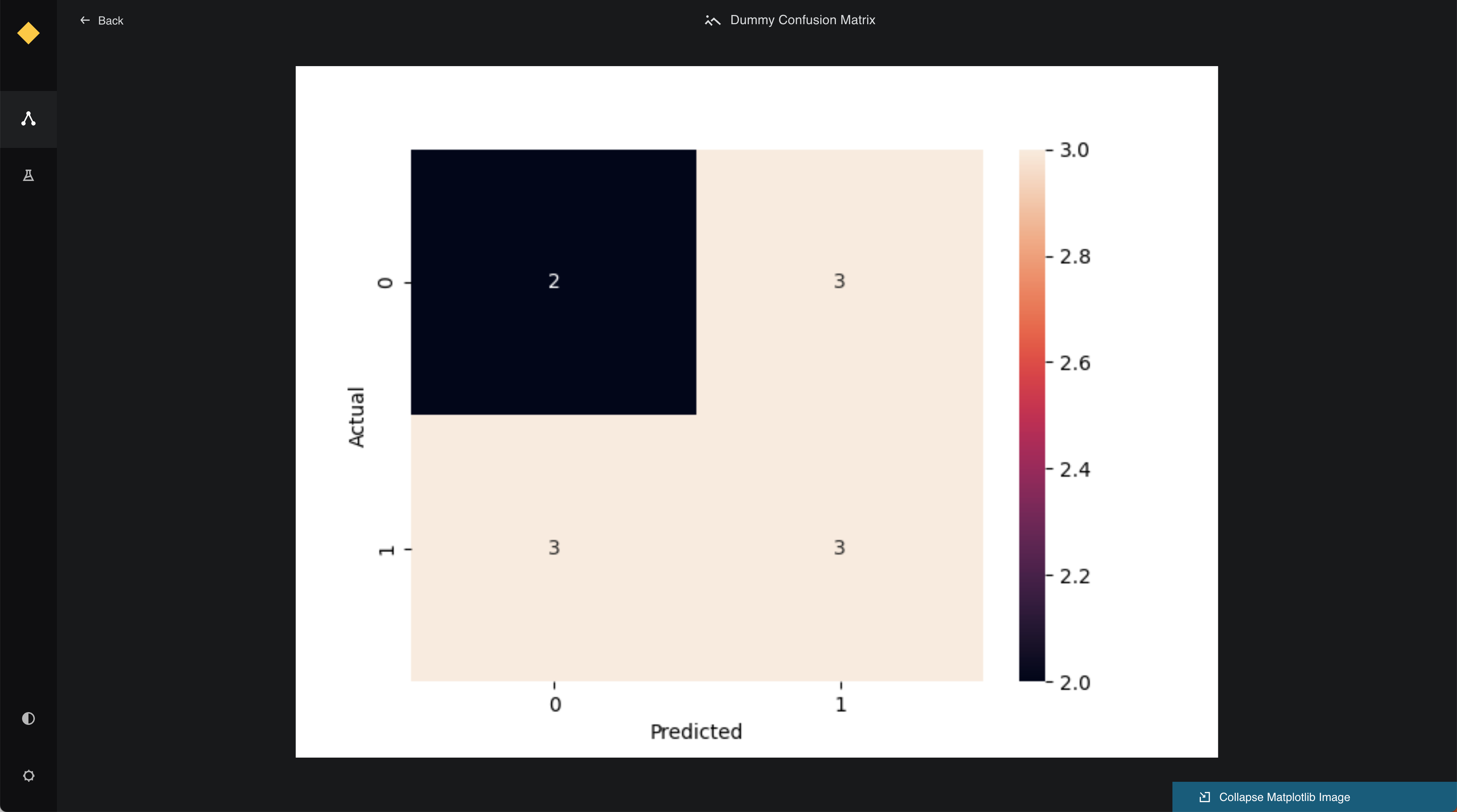
def create_confusion_matrix(companies: pd.DataFrame):
actuals = [0, 1, 0, 0, 1, 1, 1, 0, 1, 0, 1]
predicted = [1, 1, 0, 1, 0, 1, 0, 0, 0, 1, 1]
data = {"y_Actual": actuals, "y_Predicted": predicted}
df = pd.DataFrame(data, columns=["y_Actual", "y_Predicted"])
confusion_matrix = pd.crosstab(
df["y_Actual"], df["y_Predicted"], rownames=["Actual"], colnames=["Predicted"]
)
sn.heatmap(confusion_matrix, annot=True)
return plt
Update the pipeline
Update src/spaceflights/pipelines/reporting/pipeline.py to add the following to create_pipeline:
from .nodes import create_confusion_matrix

...


def create_pipeline(**kwargs) -> Pipeline:
    """This is a simple pipeline which generates a plot"""
    return pipeline(
        [
            node(
                func=create_confusion_matrix,
                inputs="companies",
                outputs="dummy_confusion_matrix",
            ),
        ]
    )
Run the pipeline
Run the pipelines with kedro run and then visualise the result with kedro viz run.
Click to see a small preview of the Matplotlib image in the metadata panel.
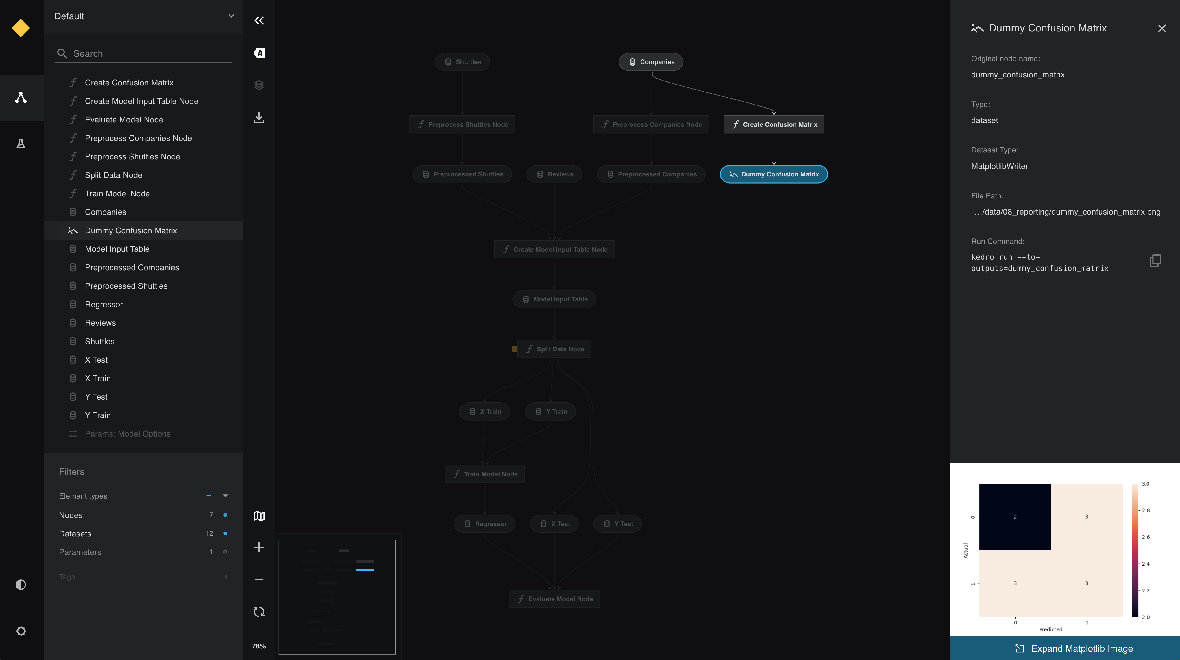
View the larger visualisation of the chart by clicking the ‘Expand Matplotlib Image’ button on the bottom of the metadata panel.